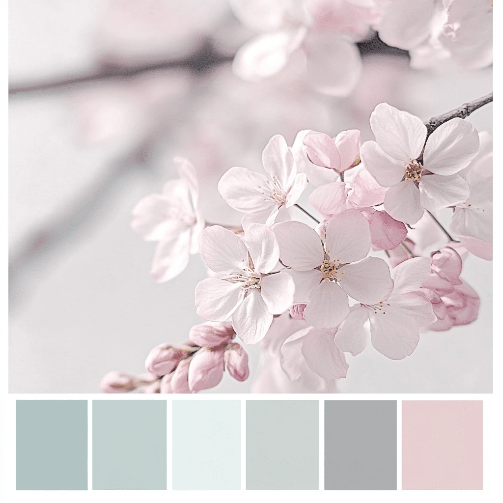
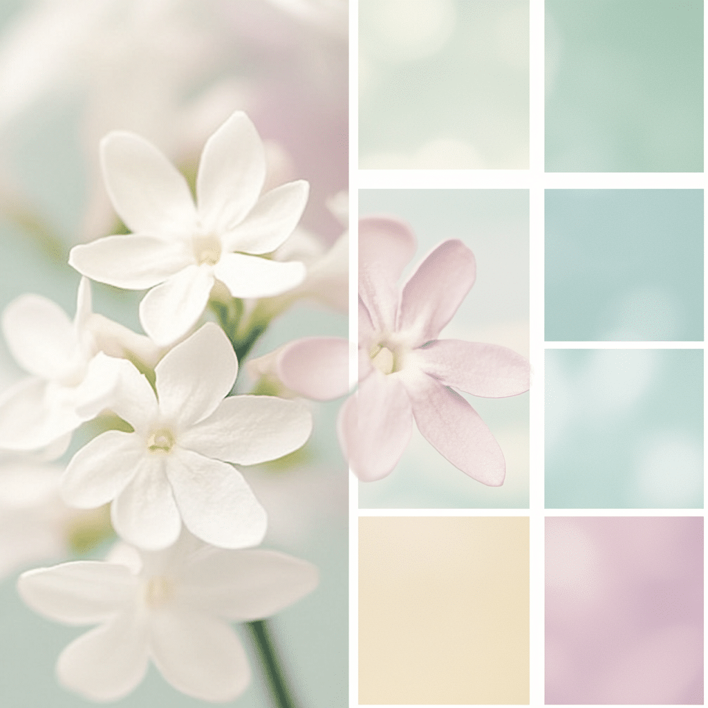
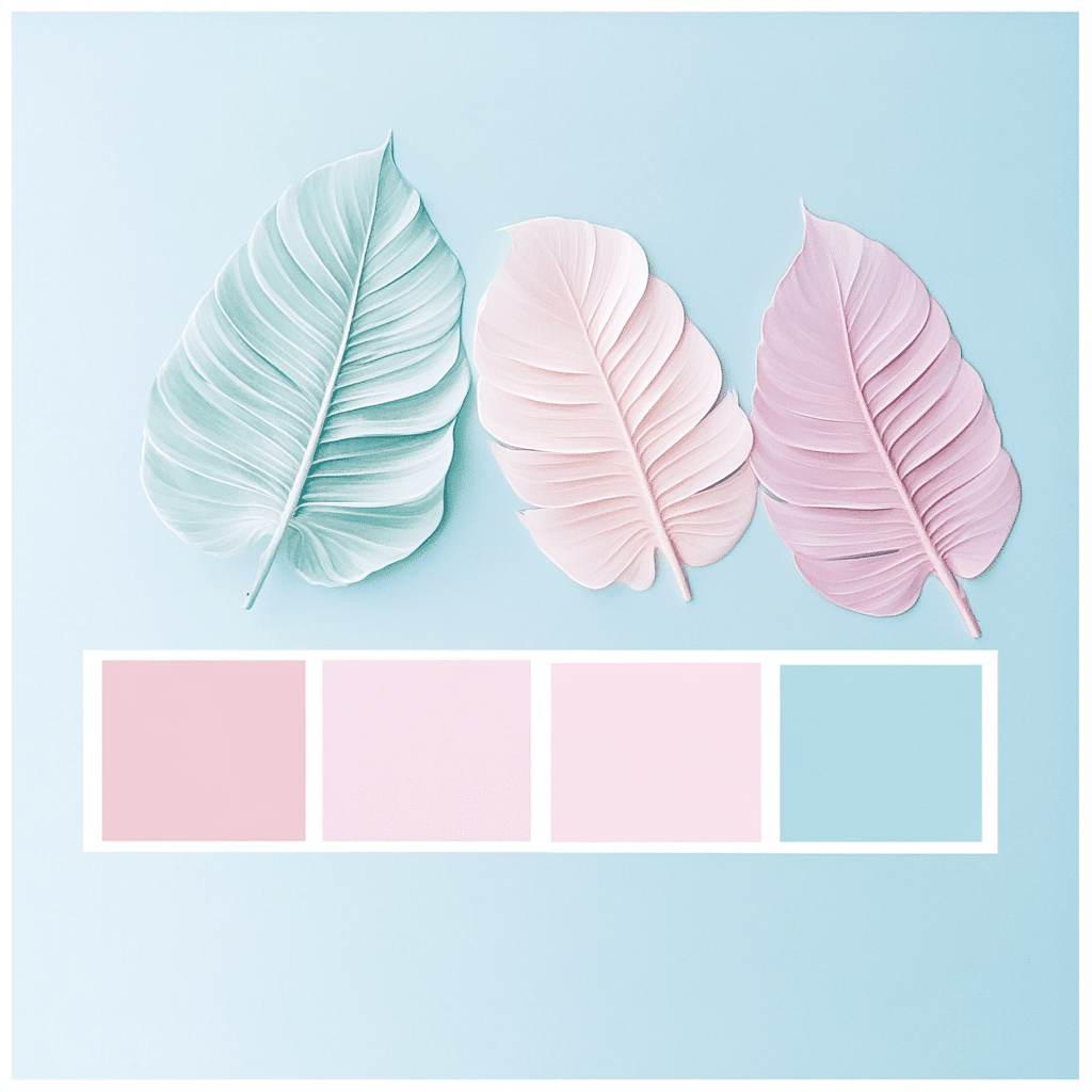
Understanding the Pastel Color Palette: A Soft Approach to Interior Design
The pastel color palette incorporates a stunning array of soft, muted tones that infuse spaces with serenity and light. These colors, often a blend of pigment and white, reflect light beautifully and foster a calm ambiance. You might be wondering how such soft hues can influence our mood and environment. Well, studies show that pastels not only create soothing settings but can also enhance creativity, making them an ideal choice for home décor.
Historically, pastels have roots in artistic movements that employed tempera paint, which allowed for delicate tones and textures. Fast forward to today, and you can find pastels used in various interior design settings, shaping environments that promote relaxation and aesthetic pleasure. Whether you’re an art enthusiast or simply someone looking to create a cozy home, understanding the pastel color palette can open a world of design possibilities that evoke positivity.
When you’re looking to revamp your living space, the pastels offer more than just eye-candy. They create a backdrop that harmonizes with numerous styles, from modern minimalism to retro chic. By tapping into the psychological effects of these colors, you can transform ordinary spaces into nurturing havens that resonate with tranquility.
Top 7 Pastel Color Palette Strategies to Brighten Up Your Home
1. Accent Walls with a Twist: Embrace Soft Terracotta
Think beyond the typical pastel shades and consider soft terracotta for an accent wall. Farrow & Ball’s “Blush Pink” is a perfect example, providing warmth without overwhelming the senses. Pair this mellow hue with whites or beiges to craft a stunning backdrop that enhances light in your space and feels genuinely inviting.
2. Layering Textures for Depth
Texture is key when working with pastel colors. By mixing materials like cotton and linen in soft colors, you create layers that add depth and interest. Brands like West Elm provide pastel throw pillows in soft mauve and baby blue that work like a charm together. This method leads to a cohesive look that feels both dynamic and soothing.
3. Artistic Touch: Incorporating Pastel Tempera Paint
Ever thought of adding a personal touch with artwork? Tempera paint opens the door to creativity. Consider crafting your own pastel art pieces or DIY’ing a side table using colors from Dick Blick’s selection. This hands-on approach adds character to your home and establishes a space that’s uniquely yours.
4. Pastel Furniture: The Statement Piece
Investing in pastel-colored furniture takes your room’s vibe to the next level. Explore offerings like the “Cloud Blue” sectional from Article, designed to blend seamlessly with a variety of décors. This allows you to showcase your personality without straying from the calming pastel theme that wraps your home in comfort.
5. Accessorizing with Vintage Finds
Injecting personality into your space is as easy as scouring thrift shops or platforms like Etsy for vintage pastel accessories. Look for ceramics and décor that resonate with nostalgia, like pastel vases that echo a bygone era while easily pairing with modern styles. These unique pieces help tell your home’s story and add depth to your décor.
6. Creating a Pastel Garden Oasis
Why stop indoors? Extend your love for pastels outside with soft-toned flower arrangements. Companies like Wayfair offer lovely pastel patio furniture that creates a serene outdoor environment. Pair this with pastel blooms like soft pink petunias or lavender for outdoor spaces that offer visual pleasure and a touch of tranquility.
7. Using Pastels in Lighting Design
Lighting can dramatically alter how colors appear in a room. Consider adding pastel-shaded lampshades or opt for soft pastel-colored LED bulbs from Philips Hue. With the right ambient lighting, you can achieve a gentle, inviting glow that works harmoniously with your pastel theme, enhancing the overall mood of any room.
Final Thoughts: Embracing the Pastel Lifestyle
Incorporating a pastel color palette into your living spaces can drastically change your environment, making it feel lighter and more welcoming. By thoughtfully selecting paint colors that meld well with your furnishings and curating your décor, the strategies discussed here can lead to a genuinely refreshing atmosphere. Not only does the pastels’ charm lie in their visual appeal, but their capability to cultivate a sense of calm and comfort turns any house into a home.
As homeowners collectively lean towards crafting aesthetically pleasing havens, the timeless allure of pastels reignites conversations about design creativity. By breathing life into our personal spaces with color, we cultivate not just beautiful homes, but also nurturing sanctuaries that encourage us to embrace life with open arms. So why not take that leap and bring a pastel revival into your world? Your space and your spirit will thank you!
Pastel Color Palette Strategies to Brighten Your Space
A Splash of Color in Everyday Life
Did you know that pastel colors have a fascinating history? The soft hues we adore today were first popularized in the 18th century by French Rococo artists, who wanted to create a softer, more romantic aesthetic in their work. Speaking of vibrant history, just think of musical legends like Aretha Franklin, who could match the energy of any pastel palette with her powerful voice and emotion.
These colors have a unique quality that makes them both calming and energizing, striking a perfect balance. For instance, light blue can evoke the feel of an open sky, while a soft pink might bring to mind the charm of childhood memories, like snuggled-up afternoons watching shows like El Chavo Del Ocho. Imagine bringing these feelings into your living space with a carefully selected pastel color palette—it’s a great way to cultivate a cozy atmosphere.
Finding the Right Mix
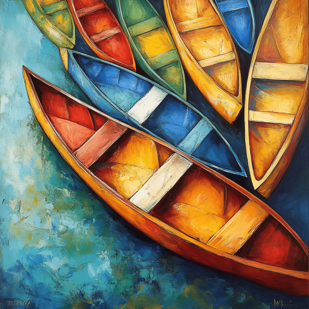
Now, let’s talk about mixing and matching those pastel shades! One fun fact is that these colors work beautifully with natural materials. Think about incorporating items like Canoes or wooden furniture to complement your chosen hues. Such combinations can transform a room from drab to fab without a hefty price tag!
A little technique many designers swear by? Use a trio of pastel shades for a harmonious look, much like how someone might curate their favorite collection of teen boy Haircuts or accessories. Balancing different tones can create a visually appealing environment while keeping the mood light and playful; after all, who doesn’t want a space that feels like a storybook?
Tips for a Polished Finish
Lastly, while working your magic with pastels, it’s wise to finish off with the right accents. Think about incorporating pastel-colored art or decorative pieces to tie everything together. And just as ratchet Straps secure loads with style, the right decor can keep your pastel color palette looking chic and seamless.
And don’t forget, lighting can play a huge role in how these colors pop! Using the right lighting can soften the overall look, much like the unforgettable style of Pam Byse, who captures elegance in simplicity. So, whether you’re decorating a cozy nook or your entire home, don’t hesitate to embrace the pastel color palette and bring a fresh, inviting atmosphere that’ll make your space stand out. If you’re planning a getaway, consider how even downtown San diego Hotels often utilize pastel tones to create a approachable vibe—proof that these colors can be both trendy and timeless!